
Responsive Images with srcset and sizes: How the Browser Picks, and Art Direction with picture
You add a srcset with four widths to your product cards, feel good about it, and then open the Network panel on a desktop: every card in the three-column grid downloads the 1600px file. Nothing is broken. You left out sizes, so the browser assumed each card was as wide as the whole window and picked accordingly.
That's the most common responsive-images bug, and it comes from not knowing how the browser actually chooses. This post walks through the selection with real numbers, then covers x descriptors, art direction with <picture>, the newer sizes="auto", and what Next.js does on top.
Two different problems
MDN's responsive images guide separates them cleanly:
- Resolution switching: the same picture at different sizes, so a phone doesn't download a desktop-sized file and a high-density screen doesn't get a blurry one. That's
srcsetplussizeson a plain<img>, orxdescriptors for fixed-size images. - Art direction: a different crop or composition at different layouts, for example a tight portrait crop on phones and a wide shot on desktop. That's
<picture>with<source media>.
There's a third job that uses the same element: format switching, where <source type> offers AVIF or WebP with a fallback. Mixing these up is how people end up with <picture> wrappers that do nothing a plain srcset couldn't.
How the browser picks from srcset and sizes
Take this card image:
<img
  src="/img/chair-800.jpg"
  srcset="/img/chair-400.jpg 400w,
          /img/chair-800.jpg 800w,
          /img/chair-1200.jpg 1200w,
          /img/chair-1600.jpg 1600w"
  sizes="(width <= 640px) 100vw,
         (width <= 1024px) 50vw,
         400px"
  width="1600" height="1200"
  alt="Oak dining chair, side view">
The w descriptor is the file's real pixel width; MDN says it "must match the intrinsic width of the referenced image". sizes says how wide the image will be displayed at each layout, in CSS pixels. Then:
- The browser evaluates the media conditions in
sizesleft to right and uses the first one that matches. Order matters: MDN notes "the browser ignores everything after the first matching condition". The last entry has no condition and is the default. - That gives the source size, the expected display width.
- For each candidate, the HTML spec computes an effective density: the width descriptor divided by the source size. A 400w file shown at 320 CSS pixels has a density of 1.25x.
- The browser picks a candidate whose density suits the screen's pixel density and zoom level. The spec leaves the exact choice to the browser, and lets it use an image it already has cached instead.
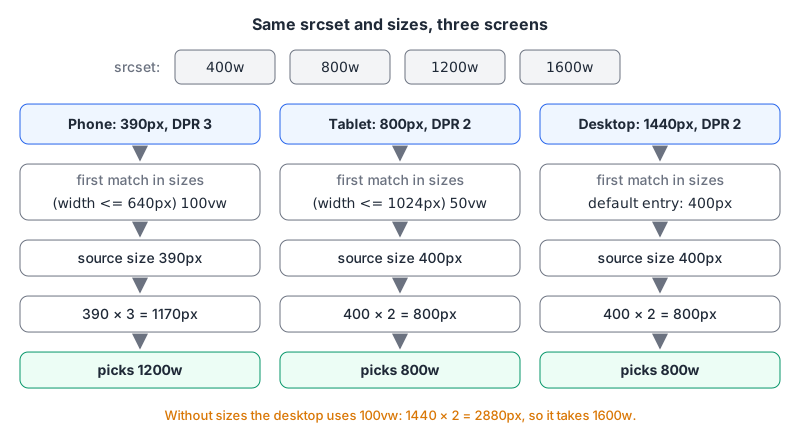
Run the numbers for three screens:
| Screen | Viewport | DPR | Matching sizes entry | Source size | Pixels needed | Likely pick |
|---|---|---|---|---|---|---|
| Phone | 390 px | 3 | (width <= 640px) 100vw | 390 px | 1170 | 1200w |
| Tablet | 800 px | 2 | (width <= 1024px) 50vw | 400 px | 800 | 800w |
| Desktop | 1440 px | 2 | default 400px | 400 px | 800 | 800w |
Desktop, no sizes | 1440 px | 2 | default 100vw | 1440 px | 2880 | 1600w |
The last row is the bug from the introduction. Without sizes, the default source size is 100vw (the spec's parsing algorithm literally ends with "Return 100vw"), so a 400px card on a 1440px screen asks for a 2880px image and gets the biggest file you offered. "Likely pick" is deliberate: browsers may round differently or reuse a cached larger file, so check rather than assume.
To check, open the console and ask the element. currentSrc returns the URL the browser selected:
document.querySelectorAll("img[srcset]").forEach((img) =>
  console.log(img.currentSrc, img.getBoundingClientRect().width)
);
If the chosen file is far wider than the rendered width times devicePixelRatio, your sizes is wrong.
Writing a sizes value that matches your CSS
sizes is a promise about your layout, made before the CSS has loaded. That's the whole reason it exists: MDN points out the browser starts fetching images before it has parsed your CSS and JavaScript, so it can't measure the slot itself. Some rules from the <img> reference:
- Media conditions describe the viewport, not the image.
- Values can be any non-negative length, and math functions like
calc()are allowed. Percentages are not. - Account for padding and gaps. A three-column grid inside a 1200px container with 24px gaps isn't
33vw; it's closer tocalc((min(100vw, 1200px) - 48px) / 3). wandxdescriptors can't be mixed in onesrcset.
Being a little generous is fine. Being wildly off, in either direction, is the problem: too small and high-density screens get a soft image, too large and you're back to downloading the 1600px file.
sizes="auto"
The cleaner answer is to let the browser measure. With sizes="auto", it uses the image's actual layout width, but only on loading="lazy" images, because by the time a lazy image loads, layout is known. The spec says auto must be the first entry, and you can follow it with a normal list for browsers that don't support it:
<img loading="lazy" width="1600" height="1200"
  sizes="auto, (width <= 640px) 100vw, 400px"
  srcset="/img/chair-400.jpg 400w, /img/chair-800.jpg 800w,
          /img/chair-1600.jpg 1600w"
  src="/img/chair-800.jpg" alt="Oak dining chair, side view">
As of November 2026, Can I Use lists support in Chrome and Edge from 126 and Firefox from 150, with Safari 27 marked partial, about 79% of users globally. The fallback list does the work everywhere else. Set width and height: if auto can't resolve and nothing else gives a size, the browser falls back to the 300×150 default.
x descriptors for fixed-size images
When an image is always the same CSS size (an avatar, a logo in the header), skip sizes and describe density instead:
<img src="/img/avatar-48.png"
     srcset="/img/avatar-48.png 1x, /img/avatar-96.png 2x, /img/avatar-144.png 3x"
     width="48" height="48" alt="Profile photo of the author">
A source with no descriptor counts as 1x, and with x descriptors the src is also a candidate. The spec notes x descriptors aren't appropriate when the rendered size depends on the viewport; that's what w and sizes are for.
Art direction with picture
When the crop itself should change, use <picture>. The first <source> whose media matches wins, and the <img> inside is required: it's what actually renders, and it's the fallback.
<picture>
  <source media="(width < 700px)"
          srcset="/img/hero-portrait-600.avif 600w, /img/hero-portrait-1200.avif 1200w"
          type="image/avif" sizes="100vw">
  <source media="(width < 700px)"
          srcset="/img/hero-portrait-600.jpg 600w, /img/hero-portrait-1200.jpg 1200w"
          sizes="100vw">
  <source srcset="/img/hero-wide-1600.avif 1600w, /img/hero-wide-2400.avif 2400w"
          type="image/avif" sizes="100vw">
  <img src="/img/hero-wide-1600.jpg"
       srcset="/img/hero-wide-1600.jpg 1600w, /img/hero-wide-2400.jpg 2400w"
       sizes="100vw" width="2400" height="1000"
       alt="Workshop bench with hand tools laid out" fetchpriority="high">
</picture>
Two rules keep this sane. MDN says to use media only for art direction, and when you do, don't repeat media conditions inside sizes. And order the sources so the most specific (narrow layout, best format) comes first, since the first match wins.
Which format to put in each <source> is its own question; MDN's image format guide is the reference, and the short answer is AVIF or WebP for photos with a JPEG fallback.
The attributes that aren't about choosing
widthandheight: MDN explains they let the browser compute the aspect ratio before the image loads and reserve space, which prevents layout shift. Use the intrinsic size of the largest candidate; CSS likewidth: 100%; height: autostill scales it. Our aspect ratio calculator helps when you're resizing to new dimensions.loading="lazy": defers off-screen images. Dimensions matter even more here, because an unloaded lazy image has a size of zero and may never intersect the viewport.fetchpriority="high": a hint to fetch this image ahead of other images. Useful on the main hero image, which is often your Largest Contentful Paint element; our Core Web Vitals post covers how to find it.
In Next.js
next/image writes the srcset for you, and the Next.js image docs are explicit that sizes changes what it generates:
- No
sizes, fixedwidth: a short1x/2xsrcset, right for fixed-size images. - No
sizes,fill: a srcset fromdeviceSizesonly, as if the image spans the viewport. - With
sizes: a full width-based srcset fromdeviceSizes(default[640, 750, 828, 1080, 1200, 1920, 2048, 3840]) plusimageSizes(default[32, 48, 64, 96, 128, 256, 384]).
So the card bug from the top of this post exists in Next.js too: a fill image without sizes is treated as full width. For art direction, the docs show getImageProps() producing two srcsets that you place in your own <picture>. Our next/image guide covers preload, remote patterns and the Next.js 16 defaults.
Producing the files
You need the actual widths on disk (or an image CDN that resizes on request). Our responsive breakpoint calculator takes a source width and suggests candidate widths plus a starter srcset snippet; replace its generic sizes string with one that matches your layout, and add width and height. The image resize tool resizes one file at a time in the browser if you only need a few.
Checklist
- Fluid image?
srcsetwithwdescriptors and asizesthat mirrors your CSS, gaps and max-widths included. - Fixed-size image?
xdescriptors, nosizes. - Lazy and below the fold?
sizes="auto, …"with a fallback list. - Different crop per layout?
<picture>withmedia, and no media conditions insizes. - Always
width,heightandalton the<img>. - Verify with
currentSrcat two or three viewport widths and DPRs.
Written by AIDToolStack Editorial
Researched from official documentation, specifications and vendor pages, listed under Sources below. Last checked November 2026.
Sources
- developer.mozilla.org/en-US/docs/Web/HTML/Guides/Responsive_images
- html.spec.whatwg.org/multipage/images.html
- developer.mozilla.org/en-US/docs/Web/API/HTMLImageElement/currentSrc
- developer.mozilla.org/en-US/docs/Web/HTML/Reference/Elements/img
- caniuse.com/mdn-html_elements_img_sizes_auto
- developer.mozilla.org/en-US/docs/Web/Media/Guides/Formats/Image_types
- nextjs.org/docs/app/api-reference/components/image
Related Posts
Explore on AIDToolStack
Discover tools and servers featured in our directory.
AI Tools
MCP Servers
Sponsor Our Newsletter
Reach thousands of developers who are actively evaluating AI tools, MCP servers, and dev infrastructure. Our weekly newsletter goes to engaged technical decision-makers.
All sponsored content is clearly labeled per our editorial policy.