
WCAG Color Contrast Explained: The 4.5:1 Math, Non-Text Contrast and Where APCA Stands
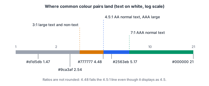
That light grey placeholder text in your search box, #9ca3af on white, looks perfectly readable on a bright laptop screen in a dim room. Run the numbers and it comes out at 2.54:1. The WCAG minimum for body-size text is 4.5:1. It isn't close.
Contrast is the one accessibility rule that is pure arithmetic, which makes it easy to check and easy to get subtly wrong: rounding a 4.48 up to 4.5, measuring against the wrong background, or forgetting that borders and icons have their own threshold. This post goes through the rules in WCAG 2.2, works one calculation by hand, covers what the formula can't see, and says where WCAG 3 and APCA stand as of November 2026.
The thresholds you actually need
WCAG 2.2 has been a W3C Recommendation since 12 December 2024, and three of its success criteria carry contrast numbers:
| Success criterion | Level | Normal text | Large text | Applies to |
|---|---|---|---|---|
| 1.4.3 Contrast (Minimum) | AA | 4.5:1 | 3:1 | Text and images of text |
| 1.4.6 Contrast (Enhanced) | AAA | 7:1 | 4.5:1 | Text and images of text |
| 1.4.11 Non-text Contrast | AA | n/a | n/a | 3:1 for UI component boundaries, states, focus indicators and meaningful graphics |
If your target is level AA, and it usually is, 4.5:1, 3:1 and 3:1 are the numbers that matter day to day. AAA is worth hitting for long-form reading text if your palette allows it.
"Large" has a specific meaning. The WCAG glossary defines large-scale text as at least 18 point, or 14 point bold. The Understanding document converts those for CSS: "14pt and 18pt are equivalent to approximately 18.5px and 24px", using 1pt = 1.333px. So 24px regular or roughly 18.5px bold qualifies. An 18px bold label does not, and neither does 20px regular. Fonts with thin strokes are a trap even above the line; the glossary notes they're harder to read at lower contrast.
The exceptions are narrow: text in an inactive (disabled) control, purely decorative text, text that's part of a picture with other significant content, and logotypes. "It's a brand colour" isn't an exception unless the text is the logo.
How the ratio is calculated
The formula is in the WCAG 2.2 glossary. First you compute the relative luminance of each colour, a 0 to 1 value where 0 is the darkest black and 1 the lightest white:
- Divide each 8-bit channel by 255 to get sRGB values between 0 and 1.
- Linearise each one: if the value is ≤ 0.04045, divide by 12.92; otherwise compute ((value + 0.055) / 1.055) ^ 2.4.
- Weight them: L = 0.2126 × R + 0.7152 × G + 0.0722 × B.
Then the contrast ratio is (L1 + 0.05) / (L2 + 0.05), where L1 is the lighter colour's luminance. It ranges from 1:1 (same colour) to 21:1 (black on white).
A worked example: #2563eb on white
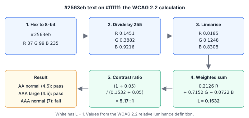
Take a common mid blue, #2563eb, as text on #ffffff.
| Channel | Hex | 8-bit | ÷ 255 | Linearised |
|---|---|---|---|---|
| R | 25 | 37 | 0.1451 | ((0.1451 + 0.055) / 1.055)^2.4 = 0.0185 |
| G | 63 | 99 | 0.3882 | 0.1248 |
| B | eb | 235 | 0.9216 | 0.8308 |
L = 0.2126 × 0.0185 + 0.7152 × 0.1248 + 0.0722 × 0.8308 = 0.0039 + 0.0893 + 0.0600 ≈ 0.1532.
White has L = 1. So the ratio is (1 + 0.05) / (0.1532 + 0.05) = 1.05 / 0.2032 ≈ 5.17:1.
That passes AA for normal text (4.5), passes AAA for large text (4.5) and fails AAA for normal text (7). Notice how little the blue channel contributes: green carries 71.5% of the weight, which is why pure blue on black looks dark and yellow on white disappears.
Here's the same thing as a script you can run, so you don't have to trust my arithmetic:
def channel(c8):
    s = c8 / 255
    return s / 12.92 if s <= 0.04045 else ((s + 0.055) / 1.055) ** 2.4

def luminance(hex_colour):
    h = hex_colour.lstrip("#")
    r, g, b = (int(h[i:i + 2], 16) for i in (0, 2, 4))
    return 0.2126 * channel(r) + 0.7152 * channel(g) + 0.0722 * channel(b)

def contrast(a, b):
    hi, lo = sorted((luminance(a), luminance(b)), reverse=True)
    return (hi + 0.05) / (lo + 0.05)

print(round(contrast("#2563eb", "#ffffff"), 4))  # 5.1686
print(round(contrast("#767676", "#ffffff"), 4))  # 4.5422
print(round(contrast("#777777", "#ffffff"), 4))  # 4.4781
Two details trip people up. The threshold constant used to be 0.03928; the glossary notes it was changed to 0.04045 in May 2021 and that the difference "has no practical effect" on results. Plenty of tools still use the old value, and that's fine. Rounding is the one that bites. The Understanding document is explicit that computed values "should not be rounded (e.g., 4.499:1 would not meet the 4.5:1 threshold)". #777777 on white is 4.48:1, which a tool showing one decimal place would display as 4.5. It fails. #767676, one step darker, passes at 4.54:1.
What the formula can't see
The maths assumes two flat, opaque colours. Real interfaces aren't always that polite.
- Transparency.
rgba(0, 0, 0, 0.5)text has no luminance on its own. You have to composite it over the actual background first and measure the result. A semi-transparent overlay on a photo can't be checked as a single pair at all. - Text over images and gradients. Contrast is measured against the background the text sits on "in normal usage", per the glossary. For a hero headline on a photo, that means the worst spot behind the letters. A scrim or solid backing panel is usually less work than proving every pixel passes.
- Missing backgrounds. The glossary calls it a failure to specify a text colour without a background colour (or the reverse). If you set
color: #555and leave the background to the browser default, a user stylesheet or dark-mode extension can put your grey on a dark grey. - Thin fonts. The Understanding document points out that anti-aliasing can render thin or unusual fonts in a much fainter colour than specified. A 4.6:1 grey in a hairline weight can be harder to read than the number suggests. Treat the threshold as a floor.
- Dark mode is a second palette. Every token pair needs checking again. If you theme with CSS custom properties, check the dark values as their own set rather than assuming an inverted palette inherits the light one's results.
Non-text contrast: borders, focus rings and icons
SC 1.4.11 is the one teams forget. It asks for 3:1 against adjacent colours for the visual information needed to identify a control and its state, for focus indicators, and for the parts of graphics needed to understand content, such as standalone icons, chart lines or pie slices, per the Understanding document.
The classic failure is the pale input border. A #d1d5db border on white is 1.47:1. If that border is the only thing telling a user where the text field is, it fails. A field with a visible label and a filled background might not need the border to pass, because the boundary only matters when nothing else identifies the control. Disabled controls are exempt, and so is the browser's default focus ring if you haven't restyled it. Once you replace the outline with your own, your version has to meet 3:1.
Charts deserve a second look too. A light-yellow line on white is invisible to a lot of people, and a legend that only uses colour leans on colour perception, which is a separate problem. Our colour blindness simulator shows how a single colour shifts under protanopia, deuteranopia, tritanopia and achromatopsia. Use it alongside a contrast check, not instead of one: two colours can have a fine contrast ratio and still be hard to tell apart.
WCAG 3 and APCA, as of November 2026
You'll see APCA (the Accessible Perceptual Contrast Algorithm) mentioned as "the WCAG 3 contrast method". As of November 2026 that isn't what the W3C documents say.
- The latest WCAG 3.0 Working Draft is dated 10 September 2026. Its text contrast requirement reads "The default visual presentation of text meets @@[contrast measure to be determined]", and an editor's note says "The contrast algorithm used in WCAG 3 is yet to be determined." The requirement is marked as developing, not final.
- The W3C's WCAG 3 introduction says WCAG 3 "is not expected to be a completed W3C standard for a few more years", that it won't supersede WCAG 2, and that WCAG 2 won't be deprecated for several years after WCAG 3 is finalised. It recommends meeting WCAG 2.2 now.
So the practical answer: report conformance against the WCAG 2.2 ratio. If you want to experiment with a perceptual model while designing, nothing stops you, but it isn't a W3C standard, and a pair that scores well on another model can still fail 1.4.3.
Testing it without a spreadsheet
In the browser. Chrome DevTools' colour picker has a Contrast ratio section with AA and AAA lines drawn across the shade area, and a button to apply a suggested passing colour, per the DevTools contrast docs. The CSS Overview panel lists every low-contrast text pair on the page under Colors > Contrast issues, which is the fastest audit of an existing site.
In CI. axe-core's color-contrast rule checks text against the 1.4.3 thresholds. Read its limits: it doesn't report text with a background image, and it lists gradients, pseudo-element backgrounds and overlapping elements as hard to detect. Elements it measures at 1:1 come back as "incomplete" for manual review. The rule maps to 1.4.3 only, so non-text contrast still needs a separate look. We cover wiring axe into Playwright, and the manual passes that cover the rest, in Accessibility Testing: axe in CI, Keyboard and Screen Reader Passes.
While picking colours. Our contrast ratio checker takes two hex colours and shows the ratio with pass/fail for AA and AAA at normal and large sizes; the "AA Large Text (3:1)" row doubles as your non-text contrast check. It works on flat colours only, so composite any transparency first. The colour converter only takes hex input and outputs RGB and HSL, so it can't turn HSL or RGB tokens into hex for you. For why HSL lightness doesn't predict contrast (two colours at the same HSL lightness can have very different luminance, because green is weighted about ten times more than blue), see Color Theory for Developers. Tailwind v4 defines its palette in OKLCH; our Tailwind colour system post covers how those tokens work, and they still need checking pair by pair.
A contrast checklist for your design tokens
- Body and UI text: at least 4.5:1, computed unrounded. 4.48 is a fail.
- Large text only gets 3:1 at 24px regular or about 18.5px bold and up.
- Input borders, focus indicators, toggle states, icons without text and chart series: 3:1 against what's next to them.
- Placeholder text is still text. If it carries information, it needs 4.5:1.
- Set text and background colours together, and check the dark theme as its own palette.
- Composite transparent colours before measuring; put text over images on a scrim.
- Report against WCAG 2.2. Revisit when a WCAG 3 draft actually names a contrast method.
Written by AIDToolStack Editorial
Researched from official documentation, specifications and vendor pages, listed under Sources below. Last checked November 2026.
Sources
- www.w3.org/TR/WCAG22/
- www.w3.org/WAI/WCAG22/Understanding/contrast-minimum.html
- www.w3.org/WAI/WCAG22/Understanding/non-text-contrast.html
- www.w3.org/TR/wcag-3.0/
- www.w3.org/WAI/standards-guidelines/wcag/wcag3-intro/
- developer.chrome.com/docs/devtools/accessibility/contrast
- dequeuniversity.com/rules/axe/4.11/color-contrast
Related Posts
Explore on AIDToolStack
Discover tools and servers featured in our directory.
AI Tools
MCP Servers
Sponsor Our Newsletter
Reach thousands of developers who are actively evaluating AI tools, MCP servers, and dev infrastructure. Our weekly newsletter goes to engaged technical decision-makers.
All sponsored content is clearly labeled per our editorial policy.