
CSS Units Explained: px, rem, em, %, Viewport and Container Units
A reader with low vision sets their browser's default font size to 24px. Your stylesheet says body { font-size: 16px; }, so they get 16px anyway. MDN's font-size reference puts it plainly: defining font sizes in px is "not accessible, because the user cannot change the font size in some browsers."
That's the strongest single reason to care which CSS unit you pick, but not the only one. 100vh hides content behind a mobile toolbar, em compounds through nested lists, and a percentage means something different on nearly every property. Here's what each unit is actually relative to, with browser support as of November 2026, and a rule of thumb for when to use it.
Absolute units: px is the anchor
The CSS Values and Units Level 4 draft fixes the absolute units to each other: 1in = 2.54cm = 96px, and 1pt = 1/72 of an inch, so 1pt is 1.333px. A CSS pixel is not a device pixel. The spec defines it through a reference pixel, roughly the visual angle of one pixel on a 96dpi screen at arm's length, and recommends the pixel as the anchor unit for screens. On a phone with a device pixel ratio of 3, one CSS pixel covers a 3×3 block of hardware pixels.
So cm, mm, in and pt won't measure true physical size on a screen. Leave them for print stylesheets, where the spec suggests a physical anchor. px remains the right unit for things that shouldn't scale with text: hairline borders, box shadows, small fixed offsets.
Font-relative units
| Unit | Relative to | Typical use |
|---|---|---|
rem | The root element's font size | Type scale, spacing, layout widths that should grow with the user's font setting |
em | The element's own font size (on font-size, the parent's) | Padding on buttons and badges that should scale with their own text |
lh / rlh | The element's (or root's) computed line height | Vertical rhythm, line-height-sized gaps |
ch | The advance width of "0" in the current font | Readable line lengths, max-width: 65ch |
ex, cap | x-height, cap height | Aligning icons with text |
ic | The advance of the CJK glyph 水 | CJK text measures |
Definitions are from the spec and MDN's length reference. The root font size is the user's default, usually 16px, unless you override it.
em compounds, rem doesn't
The one subtlety: when em is used on font-size, it refers to the parent's font size, so nested elements multiply. MDN's example sets span { font-size: 1.6em; }. With a 16px default, an outer span renders at 25.6px and a span inside it at 40.96px (16 × 1.6 × 1.6). Switch to 1.6rem and both are 25.6px, because rem always looks at the root.
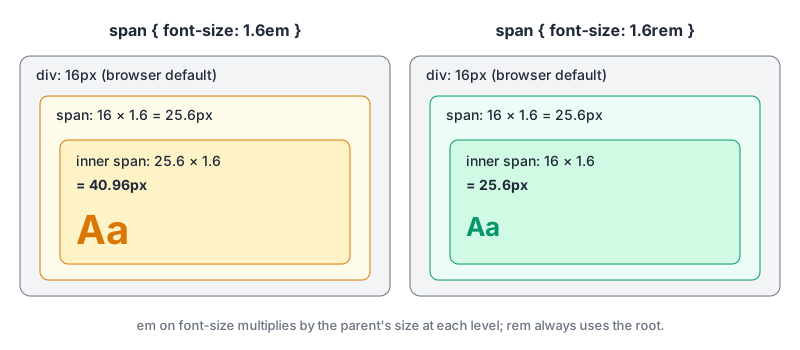
That's why I'd default to rem for font sizes and most spacing, and save em for properties that should track the element's own text. A button that uses padding: 0.5em 1em keeps its proportions at 14px and at 20px:
.button {
  font-size: 1rem;          /* follows the user's setting */
  padding: 0.5em 1em;       /* scales with this button's text */
  border: 1px solid;        /* stays a hairline */
}
.button--large { font-size: 1.25rem; }  /* padding grows with it */
lh is the newest of the commonly used ones. Can I Use lists it in Chrome and Edge 109, Firefox 120 and Safari 16.4, around 95.6% of users.
The accessibility case, precisely
WCAG 2.2's Resize Text criterion (1.4.4) requires text to scale to 200% without loss of content or function. Full-page zoom scales px too, so a px site can pass with zoom. What px font sizes break is the browser's default font size setting, which is a separate control some users rely on. The Understanding document lists relative units among the sufficient techniques: C12 (percent for font sizes), C14 (em units for font sizes) and C28 (em units for text containers). rem gives you the same effect without compounding.
A common pattern is html { font-size: 62.5%; } so that 1rem = 10px for easy maths. It still respects the user's setting (62.5% of 24px is 15px), but every third-party component that assumed 1rem = 16px now renders at 10px. I'd keep the root at 100% and use a px to rem converter for the arithmetic instead.
Percentages: it depends on the property
A percentage has no fixed meaning; each property says what it's a percentage of. Two that surprise people:
font-size: 120%is relative to the parent's font size, likeemonfont-size.padding-top: 50%is relative to the inline size (width) of the containing block, not its height, per MDN's padding-top reference. That quirk powered the old padding-hack for aspect-ratio boxes before theaspect-ratioproperty existed.
When in doubt, check the property's "Percentages" line in its MDN formal definition.
Viewport units, and why there are now four kinds of vh
vw and vh are 1% of the viewport's width and height. On mobile, the viewport changes size as the address bar and toolbars slide in and out, so the spec now defines three viewports:
- Small (
svh,svw…): sized as if the browser UI is expanded. Content sized with these always fits. - Large (
lvh,lvw…): sized as if the UI is retracted. - Dynamic (
dvh,dvw…): tracks whichever is current.
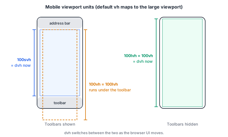
The catch with plain vh: the spec maps the default units to the large viewport, "presumed to be required for Web compatibility", and MDN confirms all current browsers do this. So height: 100vh on a phone is taller than the visible area while the toolbar is showing, and your bottom-pinned button sits under it.
dvh looks like the fix, but the spec warns dynamic units "are not stable even while the viewport itself is unchanged", and MDN says using them "can cause the content to resize while a user is scrolling", with a performance cost. My rule: svh for anything that must be fully visible (a full-screen hero with a call to action at the bottom), lvh or plain vh for backgrounds that may be clipped, dvh only when you really want the element to follow the toolbar.
.hero {
  min-height: 100vh;   /* fallback for old browsers */
  min-height: 100svh;  /* always fits above the toolbar */
}
Support is broad: Chrome and Edge 108, Firefox 101, Safari 15.4, about 96% of users per Can I Use. There are also vi/vb (inline and block axis, which matters in vertical writing modes) and vmin/vmax. Our post on responsive CSS beyond media queries shows these units in layouts alongside clamp().
Container query units
Viewport units size things by the window; a card in a sidebar doesn't care how wide the window is. Container query units, defined in CSS Containment Level 3, are relative to the nearest ancestor that is a size query container: cqw/cqh are 1% of its width or height, cqi/cqb 1% of its inline or block size, and cqmin/cqmax the smaller or larger of those.
.card-slot { container-type: inline-size; }

.card h3 {
  font-size: clamp(1rem, 0.75rem + 3cqi, 1.5rem);
}
Two things to know. The ancestor needs container-type: inline-size (or size) to count. And if there's no eligible container, the units quietly fall back to the small viewport size, so a missing container-type gives you svw-like behaviour instead of an error. Support: Chrome and Edge 105, Firefox 110, Safari 16, around 96% per Can I Use.
Keep a rem term inside clamp() when you scale text with cqi or vw. A size built only from viewport or container units won't respond to the user's font setting.
Which unit, when
| You're sizing | Use | Why |
|---|---|---|
| Body and heading text | rem, or clamp() with a rem floor | Follows the user's default font size |
| Padding inside a text component | em | Scales with that component's own text |
| Borders, shadows, outlines | px | Should stay crisp and thin |
| Line length | ch | Measured in characters |
| Full-screen sections on mobile | svh (with vh fallback) | Doesn't hide under browser UI |
| Text or spacing inside a reusable card | cqi with a rem term | Responds to the slot, not the window |
| Page-level layout widths | %, fr, rem max-widths | Relative to the container, capped readably |
| Print stylesheets | pt, cm, mm | Physical units mean something on paper |
Converting between them
Every conversion that crosses unit families needs context. rem needs the root font size, em the parent's, vw the viewport width, % the reference box. Our CSS unit converter asks for exactly those (root font size, parent and element font size, viewport size, containing block size) and converts between px, rem, em, vw, vh, %, pt, cm, mm and in. Pick the property you're converting for, because that decides what % and em mean: a percentage font-size uses the parent's font size, line-height uses the element's own, and height uses the containing block's height. It doesn't cover svh, dvh or container units, which depend on live browser state anyway. For fluid type, the responsive font calculator produces a clamp() with a rem plus vw middle term between two font sizes.
A last rule of thumb: if you can't say what a length should stay proportional to (the user's text size, the component's text, the slot, the screen, nothing at all), you're not ready to pick its unit yet. Answer that, and the table above picks it for you.
Written by AIDToolStack Editorial
Researched from official documentation, specifications and vendor pages, listed under Sources below. Last checked November 2026.
Sources
- developer.mozilla.org/en-US/docs/Web/CSS/Reference/Properties/font-size
- www.w3.org/TR/css-values-4/
- developer.mozilla.org/en-US/docs/Web/CSS/Reference/Values/length
- caniuse.com/mdn-css_types_length_lh
- www.w3.org/WAI/WCAG22/Understanding/resize-text.html
- developer.mozilla.org/en-US/docs/Web/CSS/Reference/Properties/padding-top
- caniuse.com/viewport-unit-variants
- www.w3.org/TR/css-contain-3/
- caniuse.com/css-container-query-units
Related Posts
Explore on AIDToolStack
Discover tools and servers featured in our directory.
AI Tools
MCP Servers
Sponsor Our Newsletter
Reach thousands of developers who are actively evaluating AI tools, MCP servers, and dev infrastructure. Our weekly newsletter goes to engaged technical decision-makers.
All sponsored content is clearly labeled per our editorial policy.